|
|
Post by rhodesy2112 on Sept 24, 2008 18:11:35 GMT
Well it is, isn't it!
|
|
|
|
Post by redfred on Sept 24, 2008 19:23:49 GMT
Yes but easier to read methinks.
|
|
|
|
Post by bobthecat on Sept 24, 2008 20:12:34 GMT
I was on line this afternoon and posted one in the dark and then bugger me out of darkness into light, i thought my eyes were going funny, but yes much better. ++ ;D
BTC
|
|
|
|
Post by photoxtc on Sept 24, 2008 22:23:24 GMT
Lovin the new digs!!!
very nicely done Silky ;D ;D ;D
|
|
Silky
Administrator 
Posts: 145
|
Post by Silky on Sept 25, 2008 10:30:20 GMT
Thanks! ;D To be honest I wasn't too sure after I had done it  But I think the last design had a strange blue tint to it that dint seem to really fit in with Guys latest pieces. |
|
bram
Full Member

Posts: 247
|
Post by bram on Sept 25, 2008 21:56:36 GMT
|
|
scavos
UK Moderator
Posts: 359
|
Post by scavos on Sept 29, 2008 10:28:44 GMT
I like it! Kind of...pinky sand...
Defo easier to read.
|
|
|
|
Post by misteraitch on Sept 30, 2008 8:17:54 GMT
Personally, I think it's a little too fluffy I certainly don't think it reflects Guy's work...but what do I know - I'm just an angry Northerner ;D |
|
|
|
Post by bobthecat on Sept 30, 2008 9:49:57 GMT
Therapy is quite cheap, cheaper than getting an OG GD
LOL
Your not angry misunderstood maybe.
Thinking on it yes a bit too light. But hey what the bloody hell do i know,im a mad midlander.
BTC
|
|
|
|
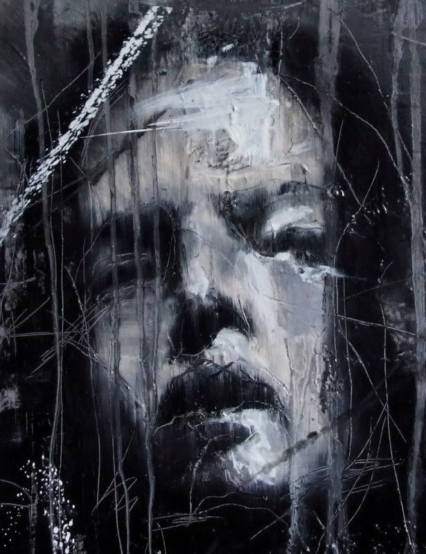
Post by GuyDenning on Sept 30, 2008 11:48:37 GMT
|
|
|
|
Post by misteraitch on Oct 5, 2008 11:17:45 GMT
Now that is a truly the most relaxing website that I've encountered! I'm actually looking at redesigning the Art 1stamp Emporium and think there's certainly a lot I can learn from there...although I think some Emir Kusturica may be better music  Aitch Aitch |
|
scavos
UK Moderator
Posts: 359
|
Post by scavos on Oct 21, 2008 22:26:57 GMT
Chuff me! That nearly brought on a seizure!!! I managed a whole minute before having to throw my laptop down the toilet. |
|